TechWire

Category - Infographic

Messaging and Social App Usage Triple in 2013


In the era of smartphones and tabs, app usage is rising rapidly. According to data by Flurry analytics, the overall app usage has increased by 115% . That means the usage has more than doubled. The category of apps with the most growth is the messaging and social apps. You would kind of expect it, considering the fact that 2013 was the year that facebook offered snapchat a whopping 3 billion dollars for acquisition. But then again tripling the usage in a single year is quite high. Maybe one can relate it to the fact that people are more and more moving away from traditional SMS, to chat apps. Even in SL the rise of apps such as whatsapp is steady.

The utility/productivity apps is the category with the second highest growth, showing that people are starting to rely on their smartphones to be organized. Take a look at the other growth rates of app categories in the below infographic by statista.

Highest growing apps in 2013

2013 with WSO2 – Infographic

WSO2 founded by Dr Sanjeewa Weerawaran in 2005, has progressed in leaps and bounds in the past 8 years. Providing clients with an open source middleware platform, WSO2 has attracted some big clients such as eBay, and has won several awards as well.

2013 has been quite a year for WSO2, from providing services to Boeing and Deutsche Telekom, to extending its footprint to the mobile domain. As we have embarked on the new year, lets take a look at the impressive achievements of WSO2 in 2013 through the below infographic.

2013 with WSO2---infographic

Twitter Stats – Infographic

With TweetupSL less than a week a way, we thought of sharing some insightful infographics on twitter. The twitter journeybegan in March 2006, and has come along way in the 7.5 years since its inceptions. Who would have thought that 140 characters would make such a difference.

Twitter has around 100 million active daily users who have contributed to a staggering 300 billion total tweets and 30 billion total tweet impressions. Take a look at the below infographic for more useful stats. (Infographic credits to brickfish).


Twitter-stats-infographic

Space Debris and Satellites – A junkyard above our heads – Infographic

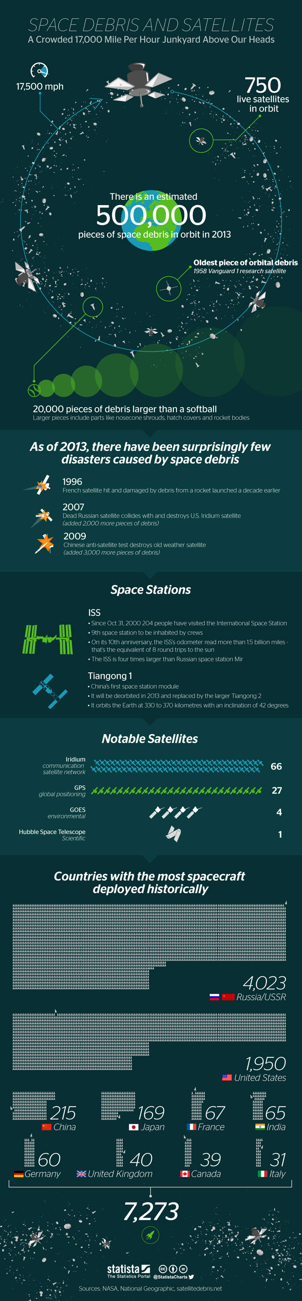
As per data released by NASA, Earths orbit is becoming quite a crowded place with over 500,000 pieces of debris. Most of these debris come about by used rocket stages, old satellites and fragments which have come apart from satellites. About 100 tonnes of debris will fall back to earth this year alone, although there are not many cases where falling debris have caused damages down below.

Apart from the useless 500,000 space debris, we have around 750 satellites orbiting earth and providing various services. Out of the total launched space satellites, Russia have launched the most number, with the US in second.

The below infographic provides more data on the debris and satellites orbiting earth. Infographic credits statista.com

Space debris and Satellites

Smartphone Battery Life Benchmark – Infographic


Year after year, smartphones continues to impress us with brand new features and their big displays. However one concern users have always had with smartphones is their battery life. You would be lucky getting enough juice to run an entire day. If you are concerned mainly on battery life, the below infographic would be useful for you.

Samsung Galaxy S4 has the highest talk time with 1051 minutes, while the Apple iPhone is on the low end with only 499 minutes. Even considering data the S4 performs the best with 405 minutes of internet usage. The tables are turned however on charging time with the iPhone taking the least time to charge with 141 minutes while the HTC One takes the longest to charge.

However there are phones such as the Motorolla Droid Maxx which is not feature below, which has far superior battery life. Also by sticking to good phone usage habits you would able to get the most battery life of your phone. (Infographic credits : www.which.co.uk)

Smartphone Battery Life

15 Years of Google

Happy B’day Google!!! The tech giant, who has changed our way of living, and who will continue to change it, turned 15 last week. From search to Youtube to Gmail, Google has touched every part of our tech ecosytem. We got two infographics lined up on Google, one which shows the dominance of Google in 7 key markets. The second one displays some key facts and stats on Google and also its various apps such as Google analytics and Youtube. Enjoy the read below. (Infographic credits to Mashable and wishpond)

Google Domination

Google Stats and Facts

UX 101 – Infographic

Since this week is buzzing with UX, we though of showcasing an infographic related to it. Did you know that 85% of UX problems can be solved through testing with 5 users? You can find more UX facts and stats in the below infographic in addition to Essentials of UX design, Benefits of UX, Key UX metrics and on calculating ROI on UX. Check it out below. (Infographic credits to homestead)

Also if you are interested in UX, you should check our article on UXColombo, and try to attend the next meetup!

UX infographic

The Next Step for NASA

To boldly go where no man has gone before….. might be the opener for Star Trek, but in the real world suits more with NASA(National Aeronautics and Space Exploration) who has made strides in space exploration in leaps and bounds. NASA is most famous for the Apollo Moon Landings, the SkyLab space station and the Space Shuttle. As today is the 55th Anniversary of NASA, lets take a look at the future plans of NASA in its space exploration bid, including its major target of landing a man on mars by 2030. Infographic credits to Mashable

NASA next steps

The Evolution of Social Media

As social media day was celebrated last week, we thought of showcasing a Social Media infographic. Unlike any other technology, social media saw an exponential growth in adoption and has become a key part of most of our daily lives. “Likes”, “Shares”, “Hashtags”, “tweets” have all become familiar jargon to us. The below infographic displays the rise of social media and key events related to it. Where will social media lead us to, in the future?…. only time will tell. (infographic credits : http://www.randallreilly.com)

Social Media Infographic

Apple iOS7 Features – Infographic

Last week, the technology world got the first look of Apple’s upcoming OS, iOS7. In comparison to other version upgrades iO7 saw a significant change in the design and the features. The design has moved on to a flatter cleaner look courtesy of head designer Jonathon Ive. Most of the key components got a functionality revamp while some features were added on. The below infographic(by Hasan Alkhatib) gives a quick overview on the revamped components and the new ones. There were mixed opinions on the new OS, with critics hitting on the new look. What is your personal take on the new iOS7?

ios7 features